Insights
The
Insights page provides in-depth analysis of your financial data through interactive charts and detailed breakdowns. It's designed to help you understand your spending patterns, cash flow, and financial trends over time.Overview
The Insights page consists of three main subpages, each offering different perspectives on your financial data:
- Spending: Analyze your spending by category, category group, and merchant
- Sankey: Visualize cash flow relationships with an interactive Sankey diagram
- Period Analysis: Compare financial metrics across different time periods
The Spending and Sankey pages include a date range selector to filter data by specific time periods, allowing you to focus on relevant financial activity.
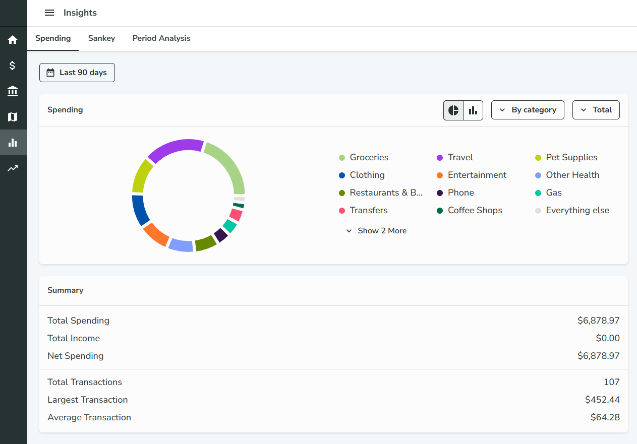
Spending
The Spending page provides detailed insights into your spending patterns through interactive charts and summary cards.
Features
- Chart Visualization: View your spending data as either a bar chart or pie chart
- Multiple Grouping Options: Analyze spending by:
- Category (e.g., Food & Dining, Transportation)
- Category Group (e.g., Home, Financial)
- Merchant (e.g., specific stores or services)
- Date Range Filtering: Use the date range selector to focus on specific time periods
- Summary Card: Get quick overview statistics of your spending
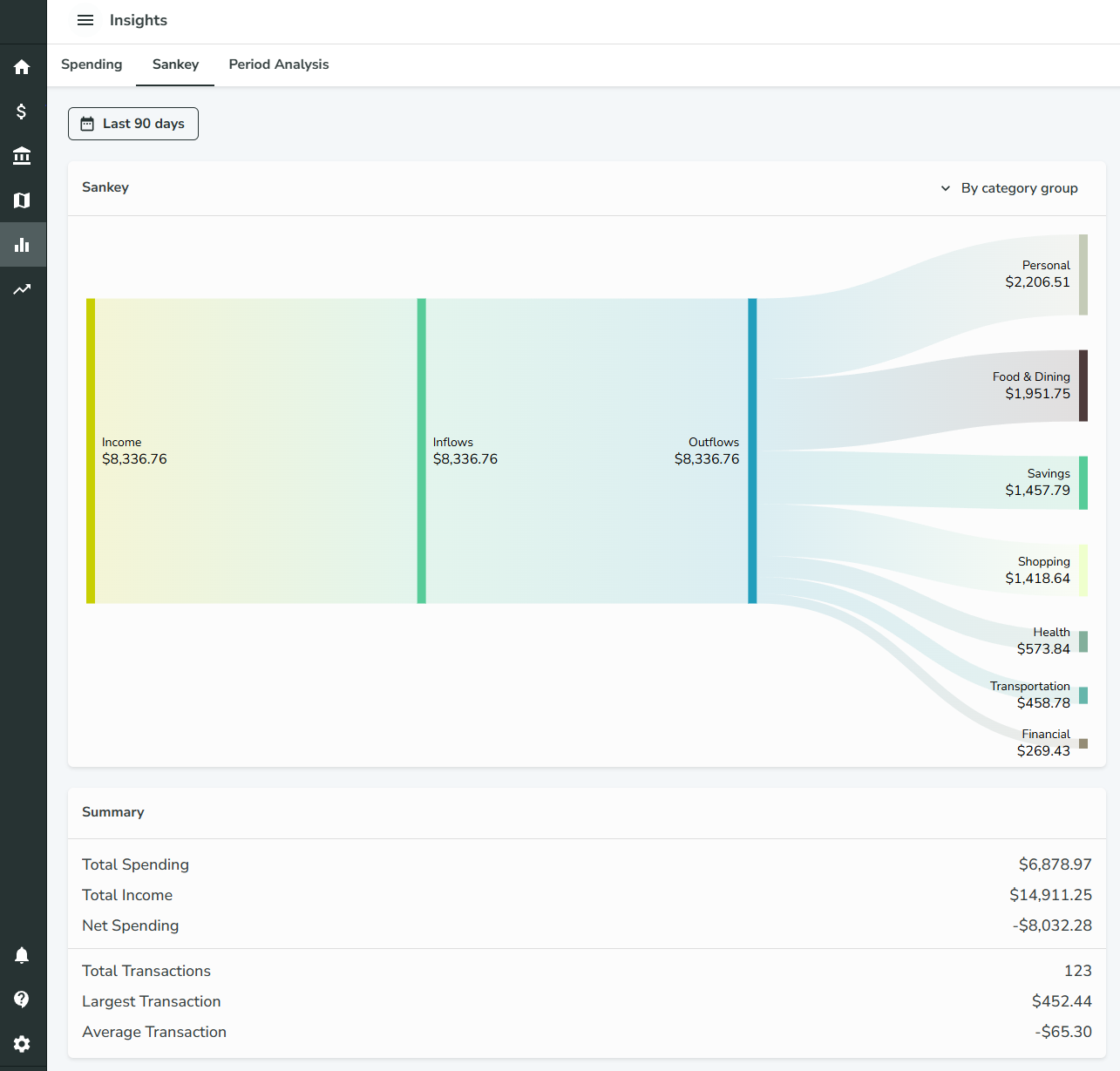
Sankey
The Sankey page visualizes the flow of money through your financial system using an interactive Sankey diagram.
Features
- Sankey Diagram: Interactive flow chart showing how money moves between different financial entities
- Multiple View Options: Display data by:
- Category only
- Category Group only
- Category and Category Group combined
- Date Range Filtering: Filter data by specific time periods
- Summary Card: Key metrics and insights about your cash flow
Understanding Sankey Diagrams
Sankey diagrams show the flow of money from one entity to another, with the width of the connections representing the amount of money flowing. This helps you visualize:
- How money flows from income sources to different spending categories
- The relationships between different financial entities
- Where your money is going and in what proportions
Period Analysis
The Period Analysis page allows you to compare financial metrics across different time periods, helping you identify trends and patterns in your financial behavior.
Configuration Options
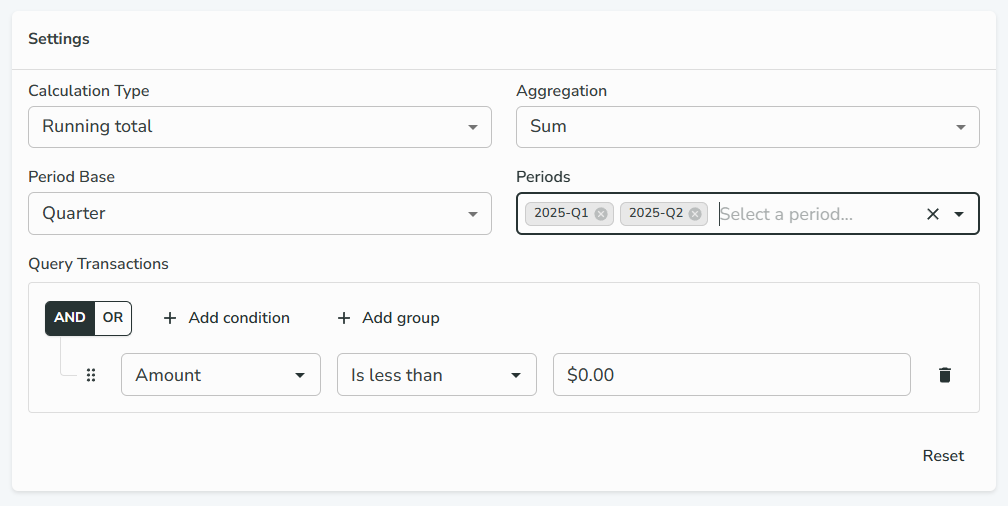
Calculation Type
- Total: Shows the total value for each period
- Running Total: Shows cumulative values over time
Aggregation Method
- Sum: Total of all values in the period
- Average: Mean value across the period
- Min: Minimum value in the period
- Max: Maximum value in the period
- Count: Number of transactions in the period
Period Base
- Quarter: Three-month periods (Q1, Q2, Q3, Q4)
- Week: Seven-day periods
- Month: Calendar months
- Year: Calendar years
Period Selection
The available periods depend on your selected period base:
- For quarters: Options like "2025-Q1", "2025-Q2", etc.
- For weeks: Options like "2025-W1", "2025-W2", etc.
- For months: Options like "2025-01", "2025-02", etc.
- For years: Options like "2024", "2025", etc.
You can select multiple periods to compare them side by side.
Query Transactions
Build complex queries to filter which transactions are included in your analysis:
- Use boolean logic (AND, OR, NOT) to create sophisticated filters
- Filter by category, merchant, amount, date, and other transaction properties
- Nest conditions in groups for advanced logic
- Similar to the query builder used in Rules
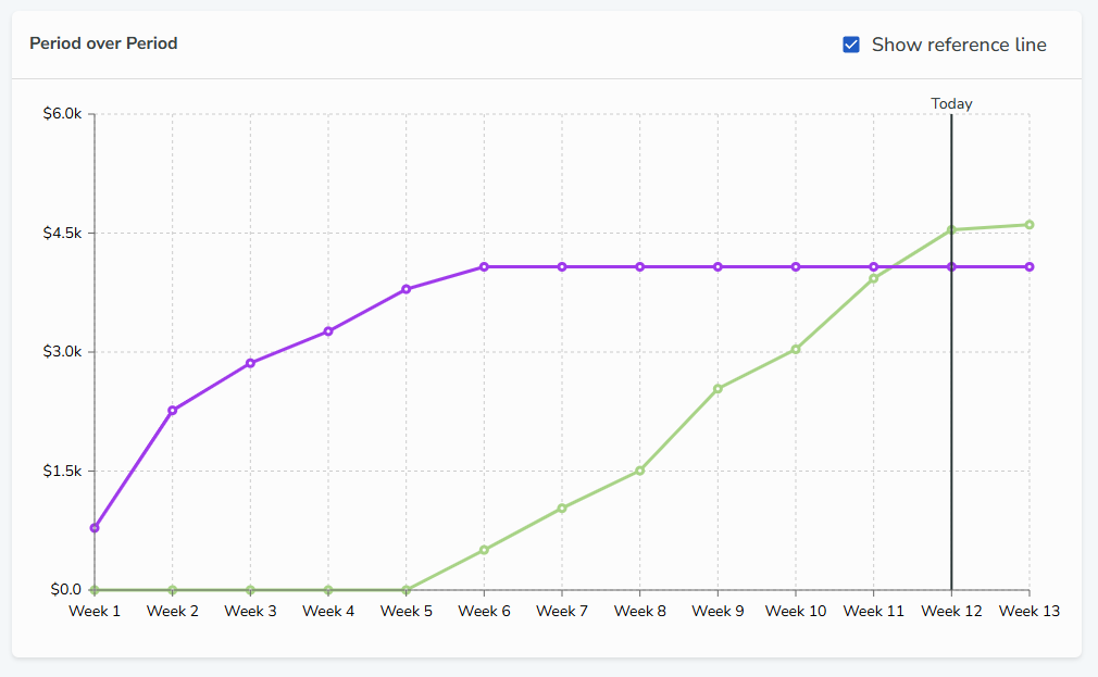
Visualization
The result is displayed as a line chart where:
- X-Axis: Represents time within each selected period
- Y-Axis: Shows the aggregated value based on your selected calculation type and aggregation method
- Multiple Lines: Each line represents a different selected period, allowing for easy comparison
- Reference Line: A vertical line indicates the current date within each period for context
Use Cases
Period Analysis is particularly useful for:
- Comparing spending patterns across different months or quarters
- Tracking income trends over time
- Analyzing seasonal variations in your finances
- Identifying long-term trends in specific categories
- Budget planning and forecasting